Charts & Analytics
Charts & Analytics
Welcome to the Charts & Analytics explorer, where data transforms into visual insights. This powerful visualization tool helps you understand patterns and relationships across your security intelligence data.
The Charts explorer provides multiple views and interactive visualizations of your filtered data.
Understanding Chart Types
Let's explore the various chart types and visualization options available.
Its important to note that the charts view is highly interactive.
The Attribute Panel and Breadcrumbs|TQL filters are global and affect the data displayed in the charts.
Regional Distribution
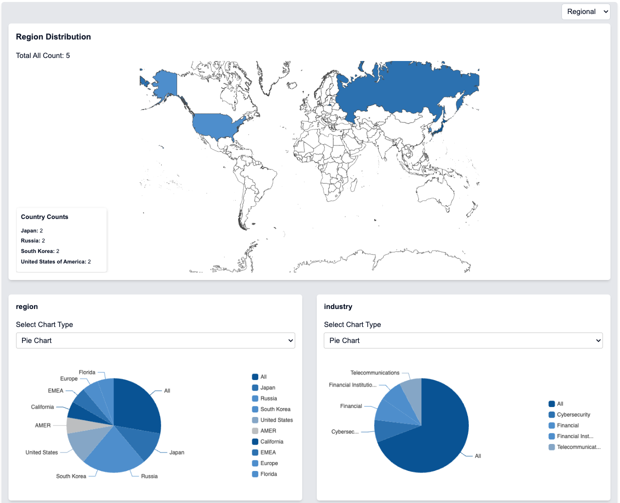
The initial display for the charts page is the regional distribution view:
- World Map: Interactive visualization of geographic distribution
- Regions: Detailed breakdown of data by country
- Industries: Overall number of items in the current view
- Category: Chart view can be filtered by category
- Tags: Tags can be used to filter the view
Chart Type Selection
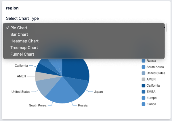
Each data category can be visualized in different ways:
- Pie Charts: Show proportional distribution
- Bar Charts: Compare quantities across categories
- Heatmap Charts: Display density and patterns
- Treemap Charts: Hierarchical data visualization
- Funnel Charts: Show stage-based progression
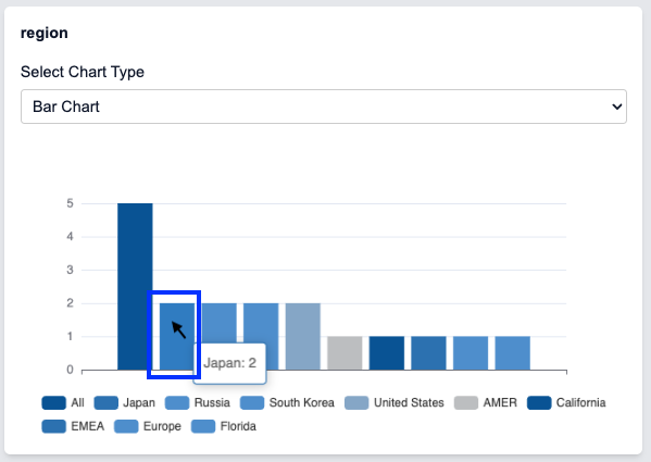
Data Interaction
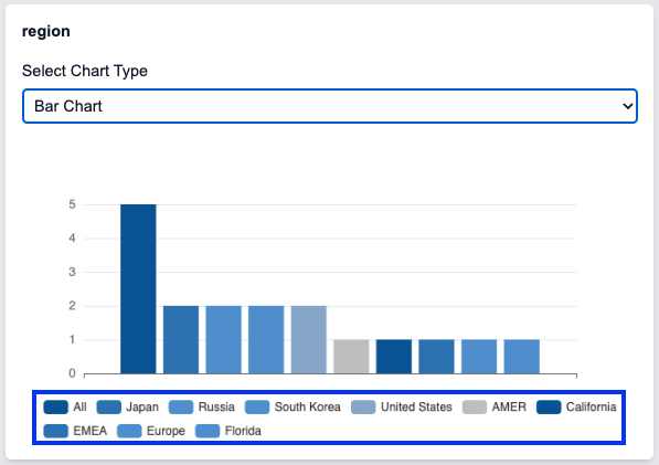
Charts are fully interactive and each graph can be filtered and drilled down into by selecting or deselecting the items within the legend:
- Click Selection: Choose specific data points
- Value Display: See exact numbers on hover
- Filter Integration: Selections update global filters
Add Filters from Charts
Double click on a chart item to add that item to the global filters:
Global Filters with Charts

Global Filters will affect the metadata displayed across ALL the charts:
Chart View Options
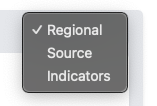
The chart visualizations can be changed to allow for different types of understanding and analysis:
- Regional: Geographic distribution of data
- Source: Analysis of data sources
- Indicators: Technical indicator breakdowns
Select the view that best suits your analysis needs.
Source Analysis
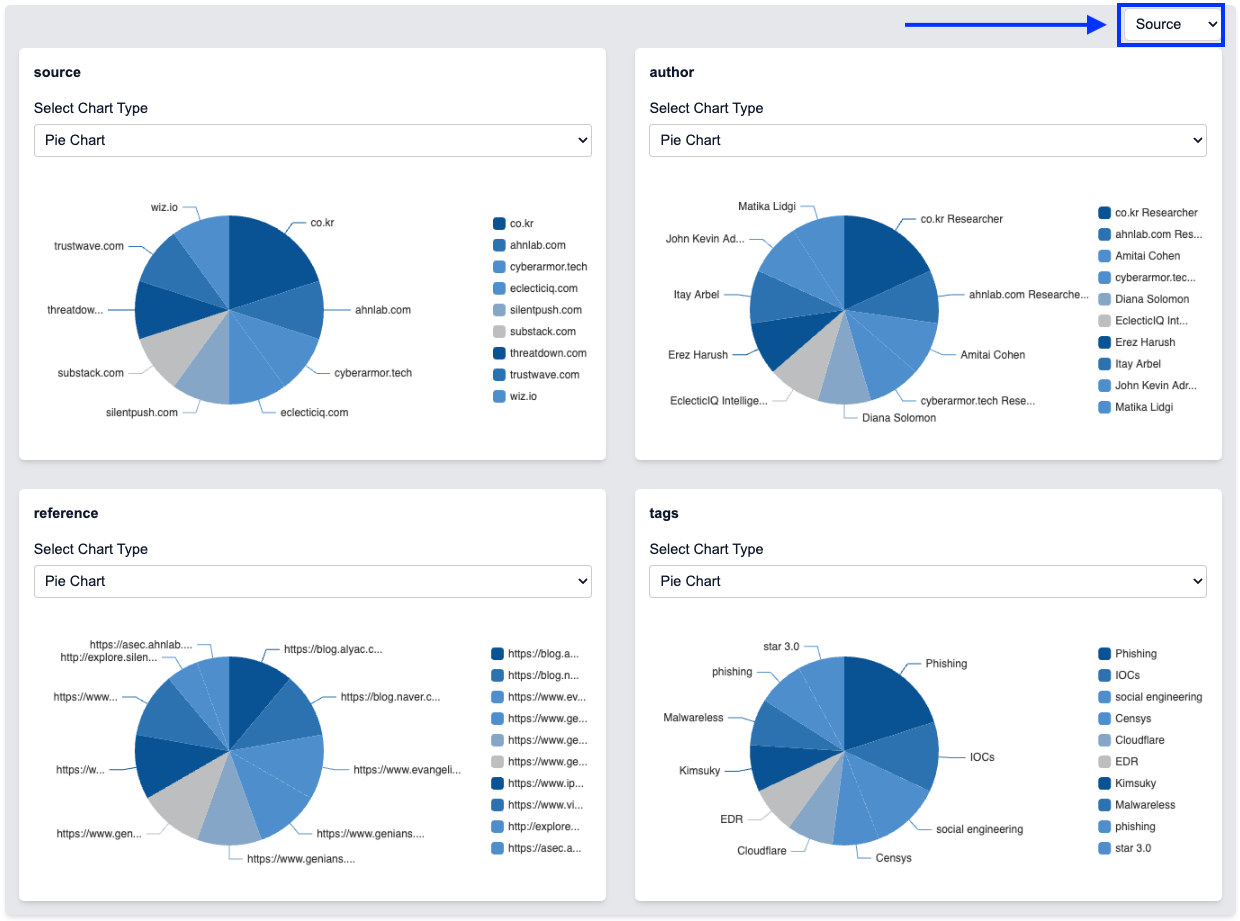
The Source view provides detailed insights into data origins:
- Source Distribution: View data by source
- Author Analysis: See author contributions
- Reference Tracking: Explore data references
- Tag Analysis: View associated tags
Indicator Analysis
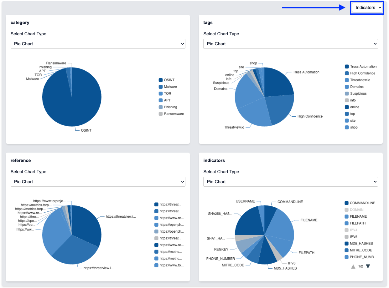
The Indicators view focuses on technical details:
- Category Breakdown: View distribution by category
- Technical Tags: Analyze technical indicators
- Reference Links: Explore related references
- Indicator Types: See different indicator classifications
Pro Visualization Tips
Interactive Features
- Legend Interaction: Click items to show/hide specific data
- Double-Click: Add items to global filters directly from charts
- View Switching: Toggle between Regional, Source, and Indicators views
- Chart Types: Switch between Pie, Bar, Heatmap, and other visualizations
Analysis Strategies
- Start with Regional view for geographic context
- Use Source view to understand data origins
- Switch to Indicators view for technical details
- Combine global filters with chart interactions for deep analysis
Remember: All chart interactions work with global filters. Changes in the Attribute Panel or TQL will update all chart visualizations automatically.